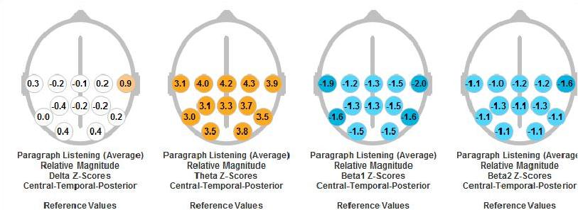
The following head figure presents one example of how the ADD pattern would be exhibited in the QEEG Excel Report.
[ezcol_2third]
[/ezcol_2third] [ezcol_1third_end] [/ezcol_1third_end]
If the location value is below normal (.50 standard deviations-SD) a blue color is filled for that circle. A darker blue is assigned to those values which are greater than 1.5 standard deviation below normative value. If the value is greater than .50 SD above the normative value, the color orange is employed, with a darker orange reflecting a value greater than 1.5 SD above the norm. The numbers in the circles represent the standard deviation value for the individual. The two head figures on the left address delta and theta relative power. These values should be in the normal range or slightly lower. The two head figures on the right present the beta1 and beta2 relative power variables. Generally, we would want these values to be in the normal range or slightly above.